Coming soon: opening of my new workshop

nouvel atelier norbert engel

Having had a foothold in Nice since 2016 and my Colmar workshop having become a little cramped, it had become relevant to plan the transfer of it to the surroundings of Nice.

As part of this research, the chance of my peregrinations led me at the end of 2020 to a city that I did not particularly like, finding it a little asleep: Menton.
With its beneficial climate, its ficus trees as tall as buildings, its old town with building facades in all shades of yellow and red ocher, the scent of herbs, the Tyrian rose of bubbling bougainvillea, the purple wisteria that bloom all year round, a lizard that will hide under a stone, the smile of a passer-by, the Salve Regina played by the four bells of the Basilica of Saint-Michel: Menton no longer slept, but began to stretch lasciviously and revealed to me one of its charms:
A hotel dating from 1860 with three floors on the ground floor “hanging” on the mountain as indicated by the etymology of Garavan, the name of the district which adjoins the old town.
The neoclassical hotel was converted into apartments in 1936.
It was in the veranda on the ground floor, which had been converted into apartments, that an apartment for sale was located.
A Belle-Epoque atmosphere, its proportions, the height of its ceilings, the calm, the view of Italy which is twenty minutes away on foot, a je ne sais quoi of extra soul, its light and its shadows, everything this seduced me on the first visit
Not insignificant detail, one of the former owners was a friend of Gustave Klimt. My imagination couldn’t help but imagine that his “Kiss” may have been hanging on the picture rails there.
All these elements, real or fantasized, made that I was able to project myself there to make it the place where I will install my new workshop and, although impatient, I embarked on renovations that will take place. ‘will be completed in October 2021.
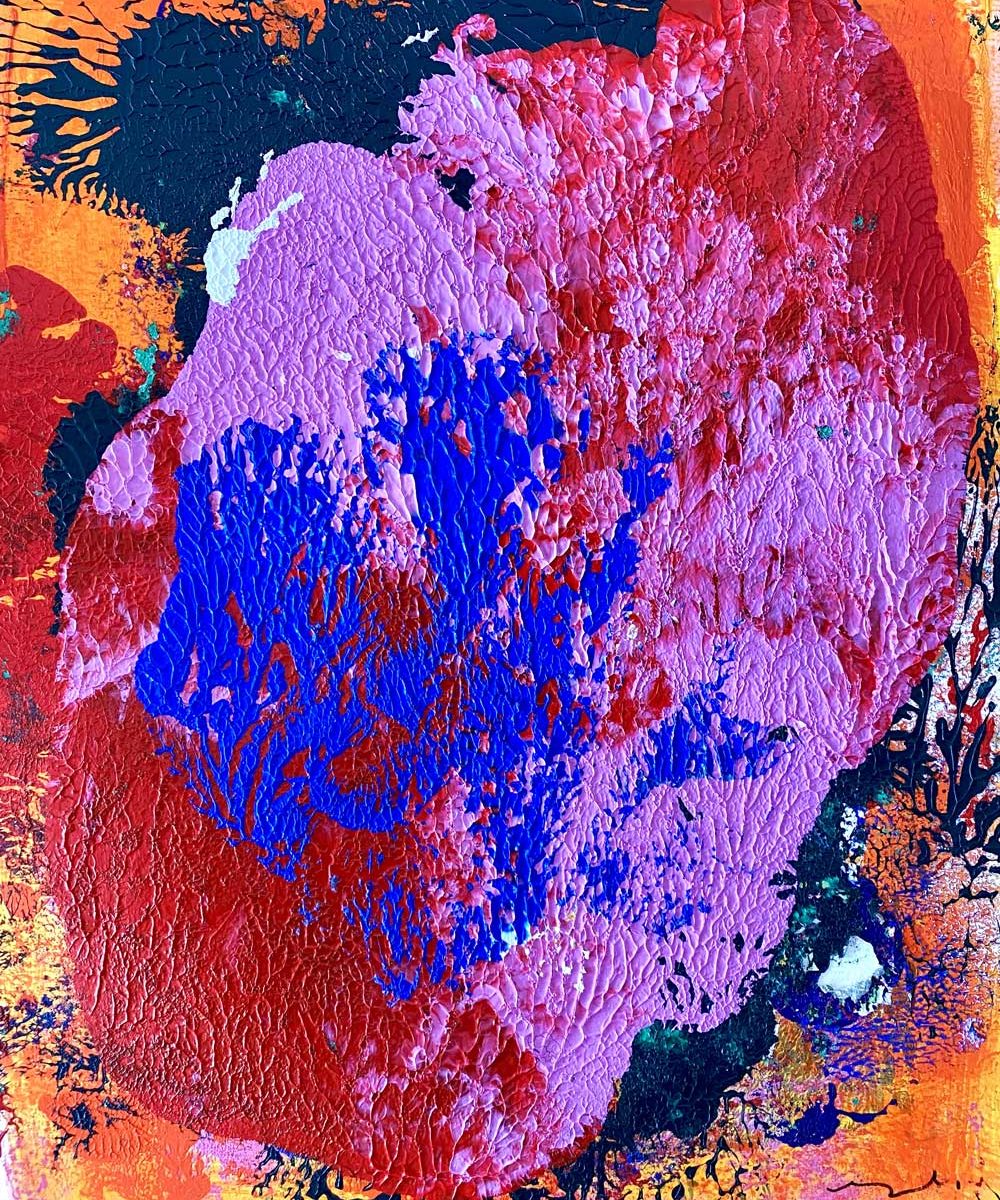
Why PALIMPSESTE?

resized-norbert-engel-Palimpseste-1

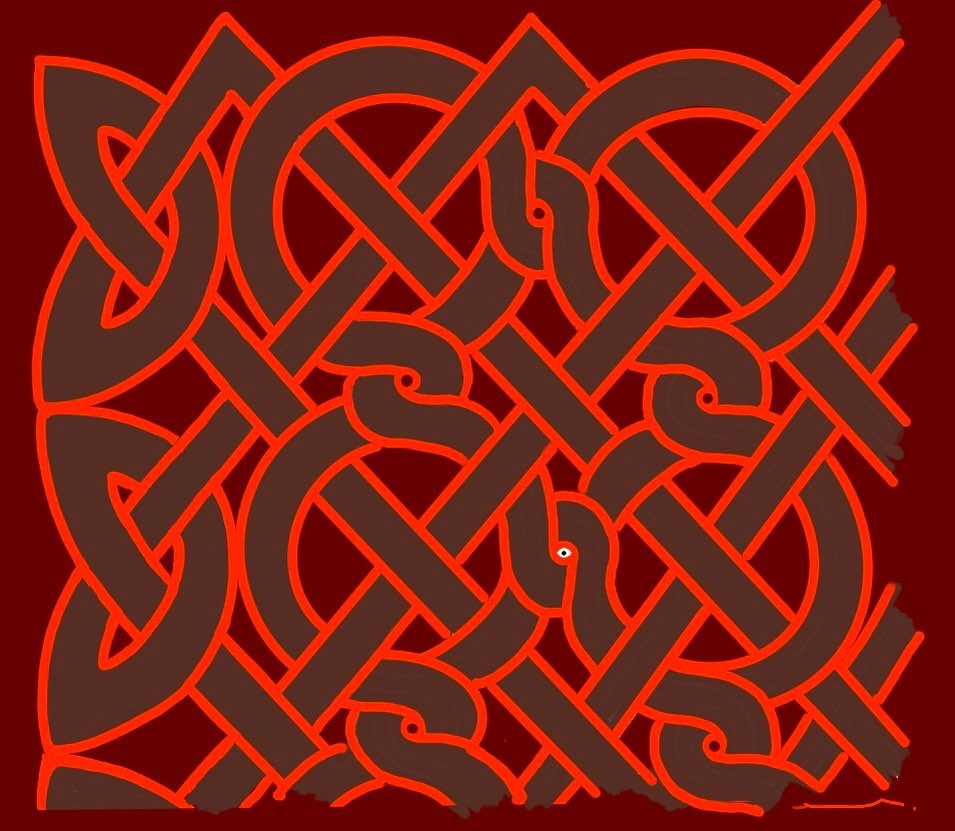
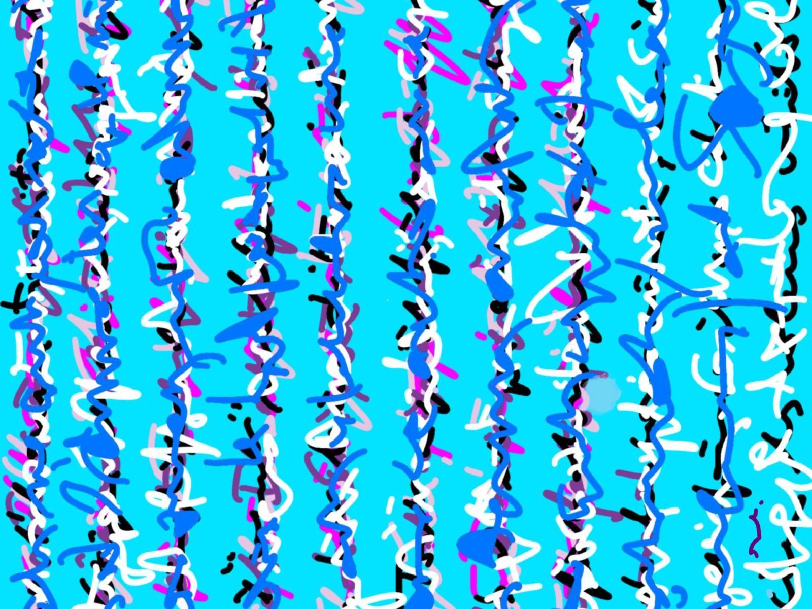
The palimpsest is a parchment that is reused several times, that is to say that old texts have been erased and then a new text has been entered and this several times.
The old erased texts nevertheless let appear some traces, which gives an impression of superimposition of writings.

The superimposed writings lose their sign values referring to a meaning but take on a uniquely expressive and emotional value thanks to the strength of the line and the contrast of the colors.

Norbert Engel on Wikipedia

Norbert Engel now has his own page in the famous online encyclopaedia Wikipedia!

The universal and multilingual encyclopaedia, created by Jimmy Wales and Larry Sanger on 15 January 2001, offers a wealth of content but remains very selective as to the personalities that can be included.

To read the article, click here.

Norbert Engel in C de L’art magazine

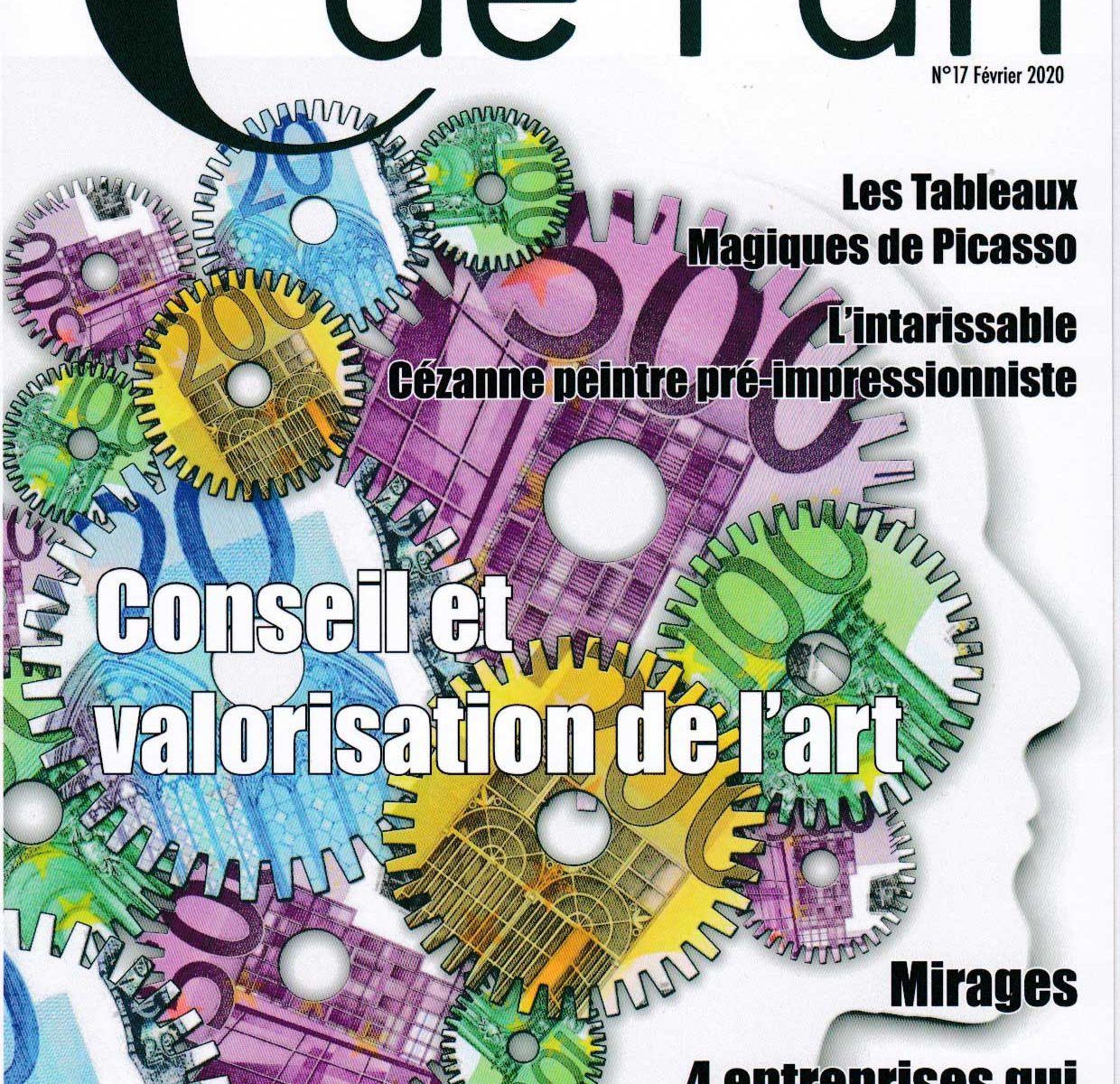
Norbert Engel was the subject of an article in the magazine “C de L’art” published by the Parisian art gallery Sonia Monti. You will find a short biography of the artist, an interview and an explanation of the work “Joie”.

To read this article, click here.

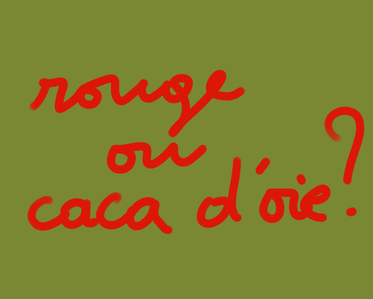
IS THERE A FAVORITE COLOR?

existe-t-il une couleur préférée

It is very difficult for a painter to answer the question: “What is your favourite colour and what is your least favourite colour? “Just as the writer needs all the letters, the painter needs all the colours and should not let go of any of them.

The choice of a colour is not only a matter of personal taste, but is often based on necessity.

How often is it a beige or goose poo that becomes the unlikely final touch to create harmony on the canvas?

Rarely is it with this type of color that the painter will start a painting!

I will rather start with a beautiful vermilion red, a cobalt blue or a golden yellow, which are the choice of the heart.

That’s it: I have just given up, abandoned, betrayed certain colors, the poor parents of painting but which the painter needs by necessity and you force me to confess that my favorite color is red!

I could also have chosen blue or yellow, but red is still the star.

And then there are the ones I am not very proud of but I am very happy that they exist, the ones that pretend to be colours but are in fact mixtures, fillings, anything: the beigasses, the salmonées.

All those colours that, by force of wanting to take themselves for real colours, end up farting higher than their asses and I come to goose poo!
Forgive my triviality, but I like to speak raw; maybe that’s why I’m a painter: painting allows this direct and massive frank expression, without convolutions.

So to bend to the exercise, I definitely choose red as my favourite colour and the opposite, beige.

Beige is the worst of compromises!
I could also have chosen another hybrid colour like the salmon that I get by mixing red and yellow with white: that’s already a lot of mixtures!

But to make beige, I have to make a first mix that doesn’t smell like holiness, let me use the expression, I’m talking about brown (which I make by combining the three primary colours red, blue and yellow), to this brown I add yellow as if I wanted to make up for something and get out of the mud.

One could point out the paradox that the partisans of the Nazi regime, who were in principle hostile to any form of mixing and thus crossbreeding, nevertheless disguised themselves in brown and beige.

Let’s go back to my favourite colour, red.
I really like the way Jean Robertet talks about red.
“Red should not be any less than any other colour:
He certainly meant that red owes nothing to other colours or to anyone: the same could be said of the two other primary colours, blue and yellow.

“Be rebuffed, for it shows victory,
Pump, pride, arrogance, vain glory,
He who does not peult up and down does not want to come down:
It’s very true! Red is the colour of the victory of life over death.

I put red on a white canvas and light the fire;

These are the glory days of an Attila who invades the steppes…

Red is creative destruction.
It’s a volcanic eruption, a rupture, all you add afterwards is to mitigate its effect.
Red is grandiose, unique and self-sufficient.
The revolutionaries took red as their emblem, the anarchists took black, I don’t know why, I would have recommended red, but a darker red.

Contrary to humility, red is arrogance and pride, red does not want to go down, cannot go down, it always aspires to go up.
The color of expansion.

Yes, I love red: the colour of all excess, the colour of desire, of growth, of excess.

Colour of blood.

The blood that “waters our furrows”.
That waters the Tanned One as Robertet would have said.

It gives life to all that is resigned, submissive, to all that doubts,
to brown and beige “that dubious can estre”.

Creation during containment

creation-pendant-confinement

Creation during containment.

Lion of everything, close to the essential.

Meditate. Balance of green tea.

Run on the spot on the living room carpet.

Sunbathing on the balcony.

Get lost by tasting an opulent red wine.

Spaghetti bolognese.

Digital creations on my iPad.

Hot bath in the bathtub.

Remember.

Chess games, small miniature lives: birth, struggle to survive, death or victory.

Let two or three squares of dark chocolate melt in the mouth.

Take photos with my iPhone.

Lying on the carpet, listen to the music of Max Richter.

Iodized explosion in the mouth of my favorite whiskey.

Reading.

Make photos-compositions on my iPad.

Music on Spotify.

Pencil on a cardboard.

Inhale deeply, breathe out fully for five minutes.

Far from my workshop, invent with the means at hand, Some tubes of gouache, some residue of acrylic paint.

Do what I prefer: stains.

A series of creations called Etants.

Attached “Being F”.

F like ….

Everyone will put the word that seems right.

Confinement, a life conducive to creative outpouring.

HantaÏ

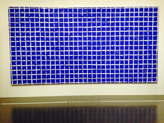
“The six paintings exhibited, from the private collection of the Gandur foundation, now a partner of the museum, represent part of the artist’s work, between 1951 and 1962.” We can clearly see the evolution of the canvas painted until ‘at the first folds, which will become the major expression of Simon Hantaï ”, describes Sylvain Amic, the director of the Réunion des musées métropolitains. After a brief stint with the surrealists, questioning the place of the abstract in the movement, Simon Hantaï will effectively develop his own research for a very gestural painting, then more and more blind using the natural folds of the canvas. “Young painters then referred to him. They talked about it as their spiritual master, like Buren, “said Daniel Hantai, the artist’s son, present for the inauguration. ”  

Regarding Hantai, I can only recommend reading the chapter by Daniel Sibony Psychoanalyst: “The notches of the other light” in his book FANTASMS OF ARTISTS from which I deliver some extracts.  

“You present yourself in life in a clear and innocent way, like a big white canvas, and the meeting of the other or the event crumples you … then you find yourself flattened, not crushed, but more or less put in dish; then you’re exposed to different lights … finally, after a certain time, you begin to straighten up, unfold, unfold, as if under the effect of resilience, a call to life; then you enter the field of Hantaï, you are in the image of one of his works. “

“To assert oneself in one’s very breaking is one of the secrets of humans. Most assert themselves in spite of themselves, rarely by themselves, others ignore that they are broken, it is the cleavage. Here, it is a luminous affirmation not of oneself but of a self in dialogue with its other; the other is the repressed which returns but which is white: its existence suffices, and above all its return, which carries the rest and makes it more radiant. ”

“It is clear that between folding and unfolding, it is a vast interaction, a dynamic and subtle in-between, full of random burrs that remind us of life. Between the whites of the repressed that returns and the colored forms, the third that stands out is the work itself, the Canvas. ”

“Hantaï compares to Rothko in the impulse of the process: to make the light of being or the being of light burst, in beauty. “

“Let’s come back to the fantasy of Hantai. In a film about him, he explains his childhood fascination with his mother’s aprons, for their metamorphosis as they are washed and ironed. And he quotes his mother saying: “When it’s done well, work, you can take the apron, you look at yourself, you see yourself as in a mirror. So would he have folded-unfolded, his mother’s “outfits”? his clothes, his habits or his folds? Now that can speak to analysts. Is white the hidden part of the mother, her nakedness? who comes back in force to carry the essential dialogue with light? It brings us a little closer to what would be his fantasy. Already the major gesture of his painting _ folding the canvas before painting_ means: acting out the existence of the repressed … .. It is a way of respecting the existence of the forbidden: he refrains from see parts of the canvas, parts that are hidden, then suddenly revealed, when the painter, passing under the canvas as in a tent, or as a child under the skirt of a cosmic mother, comes out to see better, with us, the wonder of the repressed which is even visible. This white man who comes back to structure the whole thing, we perceived it as the nudity of the mother. It’s hard not to think of Oedipus, who blinds himself to having seen and even to have enjoyed it, of these hidden parts of the mother. The artist, drawing on the richness of the light, valiantly tackles the “folded pile” to emerge victorious from the test. “

Art Shopping Review

bilan art shopping

From October 18 to 20, 2019, I had the opportunity to participate for the first time in the exhibition Art Shopping at the Carrousel du Louvre. This meeting dedicated to digital art was an enriching experience for more than one reason.

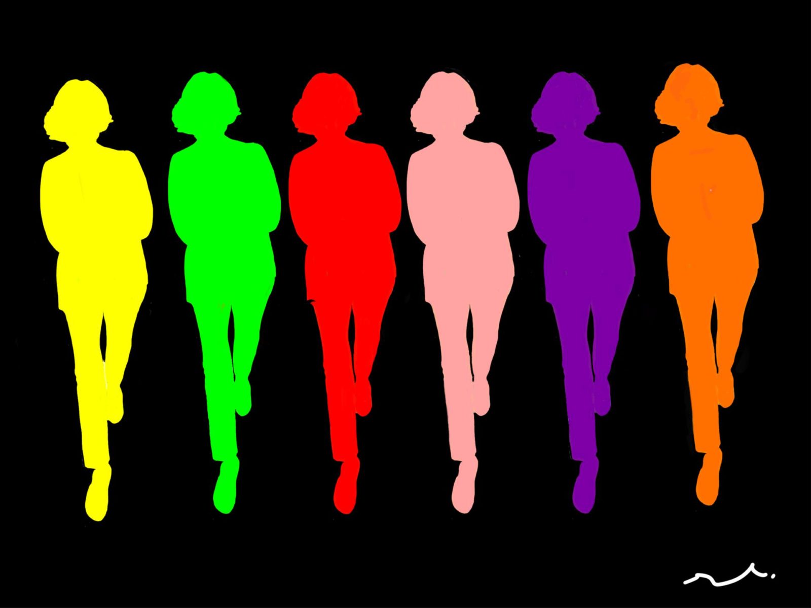
Originally, this exhibition was a “test” for my work in digital. I had a lot of visits and positive feedback, especially from professionals: “your painting stands out so much because of its very personal touch”, “your painting is in its time and very modern”, “It is a modern painting and Pop “,” you go to the essential by your minimalism “,” the colors are beautiful “.

The exhibition also allowed me to be spotted by three galleries: a Milan gallery, another gallery that wanted to exhibit one of my “nude-landscape” at the Spectrum in Miami and finally, a Parisian gallery that I will meet beginning of November !

It was also an opportunity for me to meet new people and make friends with other painters. There was a great solidarity between us, especially during the somewhat sporty moments of hanging and stalling.

Three works have been sold: two small formats (“Cinderella” and “Honey Moon”) and a very large format (“Achievements at the height of emptiness 1”).

To conclude, I have seen that digital art is pleasing. And that my PopArt style that came with the use of IPad also pleases. I therefore give you an appointment next year because the reservation has already been made but this time with a larger stand!